Program 10
a) Write a Python program to draw Time Series using Plotly Libraries.
import plotly.express as px
import pandas as pd
import numpy as np

# Generate sample time series data
dates = pd.date_range(start="2023-01-01", periods=50, freq="D")
values = np.random.randn(50).cumsum()   # cumulative sum to simulate trend

df = pd.DataFrame({"Date": dates, "Value": values})

# Create Time Series Line Chart
fig = px.line(df, x="Date", y="Value", title="Time Series Plot")
fig.show()
Output :-

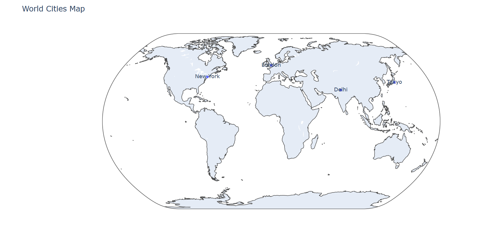
b) Write a Python program for creating Maps using Plotly Libraries.
import plotly.express as px
import pandas as pd

# Sample data with coordinates (lat, lon)
data = {
    "City": ["New York", "London", "Tokyo", "Delhi"],
    "Latitude": [40.7128, 51.5074, 35.6895, 28.7041],
    "Longitude": [-74.0060, -0.1278, 139.6917, 77.1025]
}

df = pd.DataFrame(data)

# Create Scatter Map
fig = px.scatter_geo(df,
                     lat="Latitude", lon="Longitude",
                     text="City",
                     projection="natural earth",
                     title="World Cities Map")
fig.show()
Output :-
Replay !
Share Your Thoughts